How Full Palette Designs Enhances Visual Communication
- Kenli Lacassagne
- Jul 8
- 4 min read

Visual communication is a powerful tool that can significantly impact how messages are perceived and understood. In a world where attention spans are short and information overload is common, effective visual design can make all the difference. Full palette designs, characterized by their vibrant colors and thoughtful compositions, play a crucial role in enhancing visual communication. This blog post explores how full palette designs can elevate your visual messaging, making it more engaging and effective.

Understanding Full Palette Designs
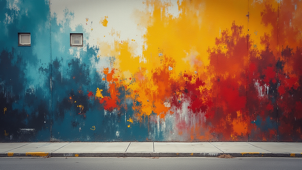
Full palette designs utilize a wide range of colors to create visually striking compositions. Unlike monochromatic or limited color schemes, full palettes embrace diversity in hue, saturation, and brightness. This approach can evoke emotions, convey messages, and capture attention more effectively.
The Psychology of Color
Colors have psychological effects that can influence perceptions and behaviors. For example:
Red can evoke feelings of excitement or urgency.
Blue often conveys trust and calmness.
Yellow is associated with happiness and energy.
By using a full palette, designers can tap into these psychological effects, creating a more nuanced and impactful visual experience.
Examples of Full Palette Designs
Art Installations: Many contemporary artists use full palettes to create immersive experiences. For instance, Yayoi Kusama's polka dot installations invite viewers to engage with vibrant colors that stimulate the senses.
Graphic Design: In graphic design, brands like Spotify use full palettes in their promotional materials to convey a sense of fun and creativity. This approach helps them stand out in a crowded market.
Interior Design: Full palette designs are also prevalent in interior design. A room painted in a variety of colors can create a lively atmosphere, making spaces feel more inviting and dynamic.
Benefits of Full Palette Designs in Visual Communication
Enhanced Engagement
Using a full palette can significantly enhance engagement. When viewers encounter vibrant colors, they are more likely to stop and take notice. This is particularly important in advertising and marketing, where capturing attention is crucial.
Improved Message Retention
Colors can aid memory retention. Studies show that people remember information better when it is presented in color rather than black and white. By incorporating a full palette, designers can help ensure that their messages stick with the audience.
Emotional Connection
Colors can evoke emotions and create connections. A well-chosen color palette can resonate with the audience's feelings, making the message more relatable. For example, a warm color palette can create a sense of comfort, while cooler tones may evoke tranquility.
Implementing Full Palette Designs
Choosing the Right Colors
When implementing full palette designs, it’s essential to choose colors that align with the message and brand identity. Consider the following:
Brand Colors: Incorporate your brand's colors to maintain consistency.
Target Audience: Understand the preferences and cultural associations of your audience.
Context: Consider where the design will be used and the emotions you want to evoke.
Balancing Color Usage
While a full palette can be vibrant and engaging, it’s important to balance color usage. Too many colors can overwhelm viewers. Here are some tips for achieving balance:
Limit the Palette: Choose a few dominant colors and use others as accents.
Use Neutrals: Incorporate neutral colors to provide breathing space and highlight key elements.
Create Hierarchy: Use color to establish a visual hierarchy, guiding viewers through the design.
Testing and Feedback
Before finalizing a design, gather feedback from your target audience. Testing different color combinations can provide insights into what resonates best. Use tools like A/B testing to compare the effectiveness of various designs.
Case Studies of Successful Full Palette Designs
Case Study 1: Airbnb
Airbnb’s website and app utilize a full palette to create a welcoming and inclusive atmosphere. Their use of vibrant colors in images and icons enhances user experience, making navigation intuitive and enjoyable. This approach has contributed to their strong brand identity and user loyalty.
Case Study 2: Google
Google’s use of a full palette in its branding and product designs reflects its commitment to creativity and innovation. The colorful logo and diverse color schemes in its applications engage users and create a sense of playfulness, making technology feel more accessible.
Challenges of Full Palette Designs
While full palette designs offer many benefits, they also come with challenges. Here are some common pitfalls to avoid:
Overwhelming the Audience
Using too many colors can confuse viewers. It’s essential to strike a balance and ensure that the design remains cohesive. Focus on clarity and simplicity to avoid overwhelming the audience.
Cultural Misinterpretations
Colors can have different meanings in various cultures. Be mindful of cultural associations when selecting colors for a global audience. Researching color symbolism can help avoid misinterpretations.
Accessibility Considerations
Not all viewers perceive colors the same way. Ensure that your designs are accessible to individuals with color vision deficiencies. Use high contrast and consider color-blind friendly palettes to enhance inclusivity.
Conclusion
Full palette designs are a powerful tool for enhancing visual communication. By leveraging the psychological effects of color, designers can create engaging, memorable, and emotionally resonant messages. As you explore the world of full palette designs, remember to choose colors thoughtfully, balance their usage, and consider your audience's preferences. Embrace the vibrancy of full palettes to elevate your visual communication and connect more effectively with your audience.
By implementing these strategies, you can create designs that not only capture attention but also leave a lasting impression. Start experimenting with full palette designs today and watch your visual communication transform.

Comments